
Project Background
During my internship at GoValley, I took on the role of Product Designer, focusing on the redesign of the GoValley student portal. GoValley is an educational institution dedicated to supporting international students in their career pursuits in the US. The portal serves GoValley’s students, which aims to enhance the overall learning experience by providing seamless access to academic resources, facilitating communication between students and instructors, and streamlining administrative processes.
Responsibilities
UX design / UX design
UXR / Usability Testing
Team
UI / UX / PM / Eng
Duration
Apr. - Aug. 2024
Tool
Figma / Jira / HTML / InVision / Protopie
The Problem
Low Adoption Rate: Despite a student body of 1,074, the GoValley student portal sees an average of only 38 active users weekly.
Rapid Engagement Decline: User interaction plummets from 11 visits to a mere 0.8 visits per person per week (pppw) after the initial onboarding period.
The Objectives
50%
3-4
Increase Active Users: Engage
of GoValley students to use student portal on a weekly basis.
Sustain Engagement: Maintain
a consistent visits pppw beyond the first week (initial onboarding period).
“
Improve overall user adoption rate by transforming the GoValley student portal into a go-to digital hub for our diverse student community
Design Process
”

Research Strategy

Before initiating the redesign of the GoValley student portal, it was essential to gain a deep understanding of the user journey and identify key pain points. Our research strategy incorporates both primary and secondary methods to capture quantitative and qualitative data. Specifically, we engaged directly with the GoValley student population through two channels:
User Surveys: We distributed 1000+ questionnaire and collected a robust sample size of over 380 responses.
User Interviews: We conducted 30+ one-on-one interviews to further explore user needs and pain points.

Persona 1*


User Profile
Name:
Age:
Gender:
Career Goal:
Pain Points
Need
Nick Wang
21
Male
Internship
Academic Profile
Level:
Major:
Location:
Tech Proficiency:
Junior college student
Data Science
United States
A clean UI with reduced information
A centralized hub and sub-entrances that make it easier to locate information
An integrated platform with all necessary tools in one place and better transparency
Familiar with US educational tools
Nick has to rely on multiple platforms and tools to meet his needs, which is time-consuming especially given his already packed schedule
Cognitive overload - excessive repetitive information on the platform makes it hard and inefficient for Nick to find important items
Persona 2*


User Profile
Name:
Age:
Gender:
Career Goal:
Pain Points
Need
Andy Zhang
25
Male
Internship
Academic Profile
Level:
Major:
Location:
Tech Proficiency:
1st year graduate student
Computer Science
US, previously studied in China
New to US educational tools
It takes time to get familiar with the US learning technologies as they differ significantly from those previously used
Andy struggles to see the benefits of the student portal due to the inability to fully explore its features
Onboarding tutorials and guidance of the student portal
Persona 3*


User Profile
Name:
Age:
Gender:
Career Goal:
Pain Points
Need
Helena Lam
23
Female
Full-time job
Academic Profile
Level:
Major:
Location:
Tech Proficiency:
Senior college student
UI/UX Design
United States
Familiar with US educational tools
Aiming for post-graduation employment, Helena struggles to efficiently find career resources while balancing her academic commitments
Helena spends excessive time switching between various career websites and note-taking platforms, which hinders her job search efficiency
In-platform career resources
In-platform tools which support the job searching and application process
Information Architecture
Before
Our team mapped out the information architecture in order to gain a better understanding of how students interact with the portal, and we discovered four main areas where we can improve.
The Problem


The Real Challenge
In the Define phase, we synthesized our extensive user research, and pinpointed three key challenges students face when using the portal. By clearly articulating these challenges, we established a solid foundation for our ideation process, which ensures we tackle the most pressing issues head-on and create solutions that truly meet student needs.


Inspiration Search
To kickstart our ideation process, our team decided to conduct extensive inspiration search before jumping into brainstorming in order to identify key areas for improvement.


Monday.com is an applications and project management platform designed to streamline teamwork and boost productivity. It offers customizable workflows, visual task boards, and real-time collaboration tools. Monday.com also integrates with numerous third-party apps, making it adaptable to various industries and work styles.

Canvas is a learning management system that facilitates online education and course management. It offers a user-friendly interface for instructors to create and organize course content, manage assignments, and communicate with students. Students can access course materials, submit work, participate in discussions, and track their progress.
Inspired Features


Inspired Features


Reward / Effort Matrix
During the ideation phase, our team generated a wide range of solutions tailored to address the identified student pain points. Then we employed a reward / effort matrix to identify and prioritize high-impact features that promise optimal returns on both user experience and business goals. We refine them further by assessing scalability, user experience, and eliminating redundant functions.

Information Architecture
After

Before
Low
Efficiency
Low
Customization
9
3
27
items in primary
navigation menu
items in secondary
navigation menu
interactive buttons
After
High
Efficiency
High
Customization
5
5
76+
items in primary
navigation menu
items in secondary
navigation menu
interactive buttons
Low-Fidelity Sketch
Dashboard


Viewing Area
Interactive Area

Task Tracker
Mid-Fidelity Prototype
We iteratively refined our conceptual sketches into mid-fidelity prototypes, allowing us to visualize and validate the information architecture and user flow of the redesigned GoValley student portal.


High-Fidelity Prototype & Usability Testing
We created fully-functional, high-fidelity prototypes of the new GoValley student portal. To validate our key performance indicators of boosting weekly active users and enhancing student engagement metrics, we executed multiple rounds of usability testing, iterating on our designs until we arrived at the final solution.
Insight 01 - Horizontal navigation was not desired
The initial design version adopted a horizontal navigation layout. However, user feedback from the usability studies revealed issues with information density and tap target accessibility. To improve clickability, we pivoted to a slide-out drawer navigation design in subsequent iterations.
Horizontal Navigation

Before Testing - Dashboard


After Testing - My Task V1
Drawer
Navigation

Insight 02 - The progress indicator was lack of scalability
After Testing - Dashboard
User feedback on the 'My Task' page highlighted scalability issues with the project progress indicator. Users also expressed dissatisfaction with the aesthetic appeal of this feature. In response, we redesigned the vertical progress bar as a horizontal format, incorporating additional information such as project collaborators, which proved more informative and scalable. Following the 2nd usability testing, we partnered with the UI team to further refine the design. We replaced filled boxes with color-coded labels, enhancing the overall visual appeal of the interface.
Vertical Progress Indicator
Lack of scalability


Before Testing - My Task
Not informative enough given the space used
Not aesthetically pleasing
Horizontal Progress Indicator - filled boxes
The progress indicator was too colorful
The filled boxes drew too much attention from users

Horizontal Progress Indicator - color-coded labels
Replaced filled-boxes with color-coded labels
Simpler and cleaner user interface
Insight 03 - The color palette was overly bright and saturated
User feedback indicated that the existing interface's color palette was overly vibrant and saturated, potentially compromising accessibility. Additionally, users felt it lacked the professional aesthetic expected of a student portal. Therefore, we collaborated with the UI team to develop a more subdued color palette. We also followed the 6:3:1 rule to create a more sophisticated visual hierarchy that better aligns with user expectations and accessibility standards.
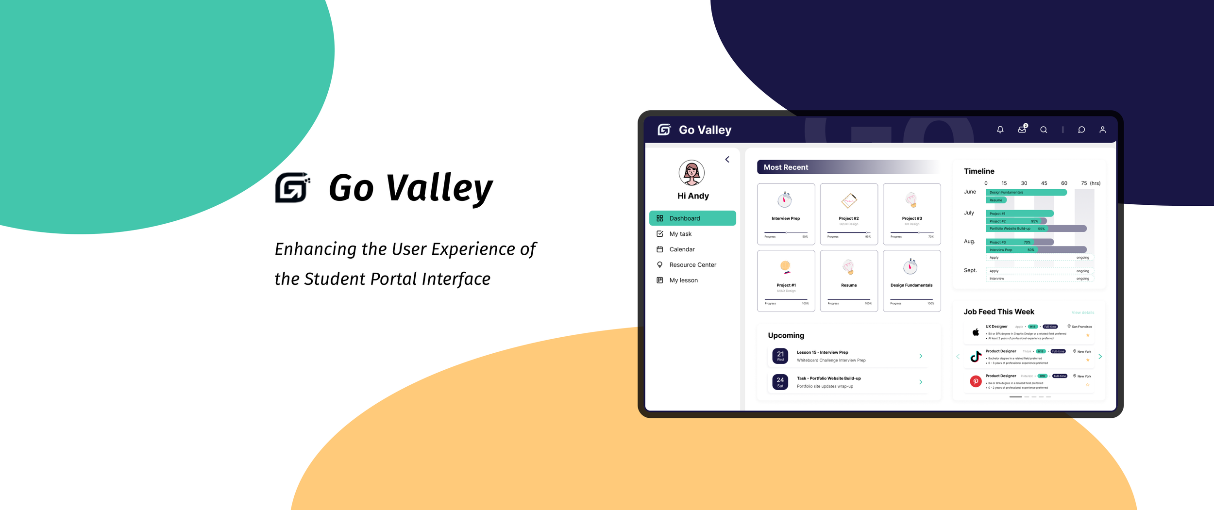
Final Delivery


Dashboard
Personalized Weekly Job Feed
One of the major pain points our users were experiencing was the time-consuming process of switching between various career websites. Our students need in-platform tools to streamline job searching and application process.
In response, we developed a personalized weekly job feed feature within the ‘Dashboard page’ which is easier for users to navigate. This AI-powered feature generates tailored job suggestions based on user preferences and filters from Haitouwang, creating a more user-centric experience.
What we achieved:
In-platform tools which support the job searching and application process
A clean UI with reduced information
A centralized hub and sub-entrances that make it easier to locate information


Calendar
User Pain Point
Another significant pain point was the fragmented user experience resulting from reliance on multiple platforms to track lesson progress and daily activities.
Task Tracker
View Schedule Through ‘My Task’ or ‘Calendar’
In response, we introduced 'My Task' and 'Calendar' functionalities to support streamlined workflow management. Specifically, we enhanced the calendar feature with the ability to add links or attach files stored within the platform when creating new events, aiming to improve user convenience and reduce cognitive load.
Streamlined Task Automation & Cross-Platform
Notifications
Users can create custom workflows by selecting from a diverse set of triggers and actions.
Users can configure automated notifications across platforms like Gmail and Zoom to keep them informed about classes and assignments.


Lesson categorization system enables efficient schedule organization and improved time management.


Resource Center


Automated Notification Center
An Integrated Platform with Multi-
Functional Tools
Centralized Resource Management: Users can efficiently store and categorize documents in resource center.
Customizable Templates: Extensive library of adaptable templates for streamlined note-taking and workflow management.
In-platform Career Resources: Syncs with Haitouwang, providing summarized job details and creating shortcuts in the user's job search process.
Shortcut to Software Ecosystem: Quick access to the most-commonly used software and tools given the background of GoValley students, creating a more seamless learning experiences.


Interactive charts with enhanced transparency displaying time allocation across lessons, tasks, and activities.


Onboarding Tutorials
The last major pain point our users were experiencing was the difficulty in fully utilizing the GoValley student portal due to unfamiliarity with US learning technologies, given their previous academic background. In response, we developed an interactive, step-by-step walkthrough to bridge this gap and maximize portal benefits.


Impact & Matrix
63%
Higher User Adoption Rate
Improve weekly user adoption rate from 3.5% to 63%.
5.7
Sustained User Engagement
Increase average number of visits pppw from 0.8 times to 5.7 times.

Takeaways & Next Steps
Simplicity is key
I learned that keeping things simple really pays off. By streamlining the navigation and information layout, I saw how much easier it became for students to find what they need. It’s not about cramming in every feature, but about making the important ones stand out.
Inspiration vs. Practicality
While hunting for inspirations can lead to some cool ideas, not everything flashy fits the bill. It’s crucial to balance the excitement of new features with what actually works for students. This project taught me to be more selective and think about how each function fits into real-life scenarios.
Takeaways & Next Steps
What’s next?
As we transition to the implementation stage, our team will continuously monitor key performance indicators and user engagement metrics. We plan to conduct periodic usability testing to gather qualitative and quantitative insights, which will enable us to refine and optimize the user experiences based on data-driven decisions and user feedback.
